Examples walkthrough
SEM offers some examples in the form of python scripts in the examples/ folder. This page walks through these scripts, explains what they achieve and how they leverage the facilities provided by SEM with different objectives.
wifi_plotting_xarray.py
The full script is available here_. This document will only show the relevant portions of the code.
This example showcases how SEM’s integration with the xarray python library can be leveraged to quickly obtain plots.
After running simulations through the
sem.CampaignManager.run_missing_simulations() method, results are exported
to an xarray data structure through the
sem.CampaignManager.get_results_as_xarray() function:
##################################
# Exporting and plotting results #
##################################

# We need to define a function to parse the results. This function will
# then be passed to the get_results_as_xarray function, that will call it
# on every result it needs to export.
def get_average_throughput(result):
    stdout = result['output']['stdout']
    m = re.match('.*throughput: [-+]?([0-9]*\.?[0-9]+).*', stdout,
                  re.DOTALL).group(1)
    return float(m)

# Reduce multiple runs to a single value (or tuple)
results = campaign.get_results_as_xarray(params,
                                          get_average_throughput,
                                          'AvgThroughput', runs)

# We can then visualize the object that is returned by the function
print(results)
This function essentially goes over the specified parameter space, and applies a user-defined function to each one, to obtain some metrics. In the case of the wifi_plotting_xarray.py example, a get_average_throughput function is defined. This function takes as parameter a result, in the form of a dictionary with the following structure:
result = {
  'meta': {
    'id': Simulation ID,
    'elapsed_time': Time spent running the simulation,
  },
  'params': {
    'param1': Value,
    ...
  }
  'output': {
    'stdout': String containing output of simulation,
    'stderr': String containing errors of simulation,
    'filename': Contents of filename output file,
    ...
  }
}
and outputs a single value, which is obtained by parsing the stdout field of the output value. The resulting structure is then saved in the results variable, and can be inspected by using the print function.
The following lines then exemplify how the results xarray can be queried through the sel function in a very natural way, by specifying the parameter and the desired value as optional parameters. Furthermore, notice how the reduce function can be used to process multiple repetitions of the same parameter combination and extract the average and standard deviation metrics:
# Statistics can easily be computed from the xarray structure
results_average = results.reduce(np.mean, 'runs')
results_std = results.reduce(np.std, 'runs')

# Plot lines with error bars
plt.figure(figsize=[6, 6], dpi=100)
legend_entries = []
for useShortGuardInterval in params['useShortGuardInterval']:
    for useRts in params['useRts']:
        avg = results_average.sel(nWifi=1, distance=1,
                                  useShortGuardInterval=useShortGuardInterval,
                                  useRts=useRts)
        std = results_std.sel(nWifi=1, distance=1,
                              useShortGuardInterval=useShortGuardInterval,
                              useRts=useRts)
        plt.errorbar(x=params['mcs'], y=avg, yerr=6*std)
        legend_entries += ['SGI = %s, RTS = %s' %
                           (useShortGuardInterval, useRts)]
plt.legend(legend_entries)
plt.xlabel('MCS')
plt.ylabel('Throughput [Mbit/s]')
plt.savefig(os.path.join(figure_path, 'throughput.png'))
Producing the following plot:
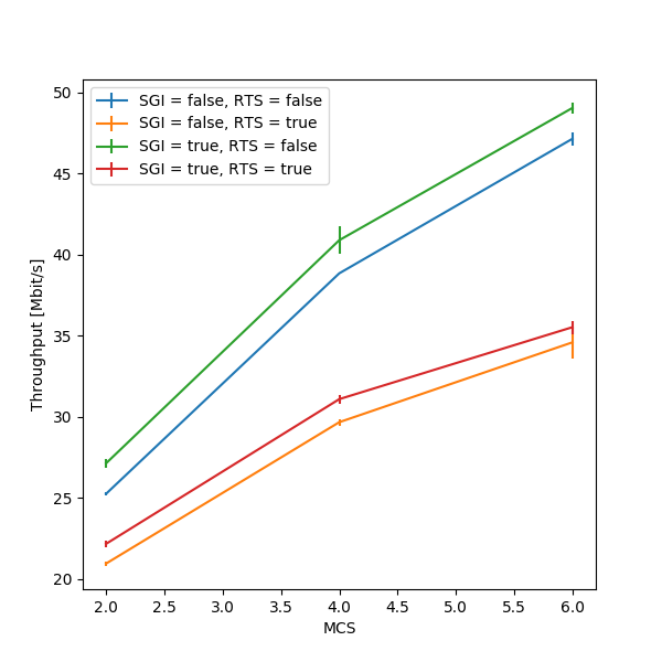
Throughput for different parameter configurations, with error bars.
Finally, let’s create a second plot: notice how the stack functionality provided by xarray was leveraged. This function essentially performs all possible combinations of the specified parameters, and plots multiple lines (one for each combination of the values) when stacked_params.plot.line() is called:
# Assess the influence of nWifi and distance parameters
plt.figure(figsize=[8, 8], dpi=300)
subplot_idx = 1
for nWifi in params['nWifi']:
    for distance in params['distance']:
        stacked_params = results.sel(
            nWifi=nWifi, distance=distance).stack(
                sgi_rts=('useShortGuardInterval', 'useRts')
            ).reduce(np.mean, 'runs')
        plt.subplot(2, 2, subplot_idx)
        stacked_params.plot.line(x='mcs', add_legend=True)
        subplot_idx += 1
plt.savefig(os.path.join(figure_path, 'throughputComparison.png'))
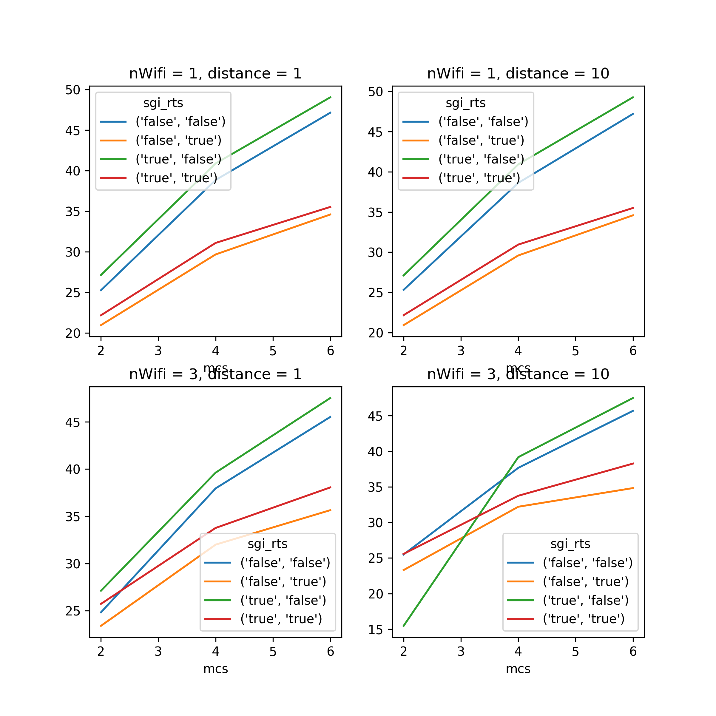
Comparison of throughput for additional parameter configurations.
lorawan_parsing_example.py
The full script is available here_. This document will only show the relevant portions of the code.
The lorawan_parsing_example.py script first shows how to use SEM to run simulations and plot results of single runs, and then shows how to use the xarray exporting function in conjunction with a custom-written function in order to extract and visualize multiple metrics at once:
After running some simulations of a LoRaWAN network [1], the script focuses on
one single result, obtained through the
sem.DatabaseManager.get_complete_results() function, and performs a couple
visualizations of the network topology and of how the value of a parameter
changes in the simulated time:
for result in [campaign.db.get_complete_results({'nDevices': 4000})[0]]:

    dtypes = {'endDevices': (float, float, int),
              'occupiedReceptionPaths': (float, int),
              'packets': (float, int, float, int, float, int)}

    string_to_number = {'R': 0, 'U': 1, 'N': 2, 'I': 3}

    converters = {'packets': {5: lambda x:
                              string_to_number[x.decode('UTF-8')]}}

    parsed_result = sem.utils.automatic_parser(result, dtypes, converters)

    # Plot network topology
    plt.figure(figsize=[6, 6], dpi=300)
    positions = np.array(parsed_result['endDevices'])
    plt.scatter(positions[:, 0], positions[:, 1], s=2, c=positions[:, 2])
    plt.scatter(0, 0, s=20, marker='^', c='black')
    plt.xlim([-radius_values[0], radius_values[0]])
    plt.ylim([-radius_values[0], radius_values[0]])
    plt.title("Network topology")
    plt.savefig(os.path.join(figure_path, 'networkTopology.png'))

    # Plot gateway occupation metrics
    plt.figure(figsize=[6, 6], dpi=300)
    path_occupancy = np.array(parsed_result['occupiedReceptionPaths'])
    t = np.linspace(path_occupancy[0, 0], 5, num=1001, endpoint=True)
    plt.plot(t, interp1d(
        path_occupancy[:, 0], path_occupancy[:, 1], kind='previous')(t))

    packets = np.array(parsed_result['packets'])

    # Plot successful packets
    successful_packets = packets[:, 5] == 0
    plt.scatter(packets[successful_packets, 0],
                np.zeros([sum(successful_packets)]), s=40, c='green',
                marker='^')
    # Plot failed packets
    failed_packets = packets[:, 5] != 0
    plt.scatter(packets[failed_packets, 0],
                np.zeros([sum(failed_packets)]),
                s=40, c='red', marker='^')

    plt.xlim([0, 5])
    plt.title("Occupied reception paths")
    plt.savefig(os.path.join(figure_path, 'receptionPaths.png'))
This example shows how the output files can be easily imported and parsed to produce visualizations of what is happening in the network.
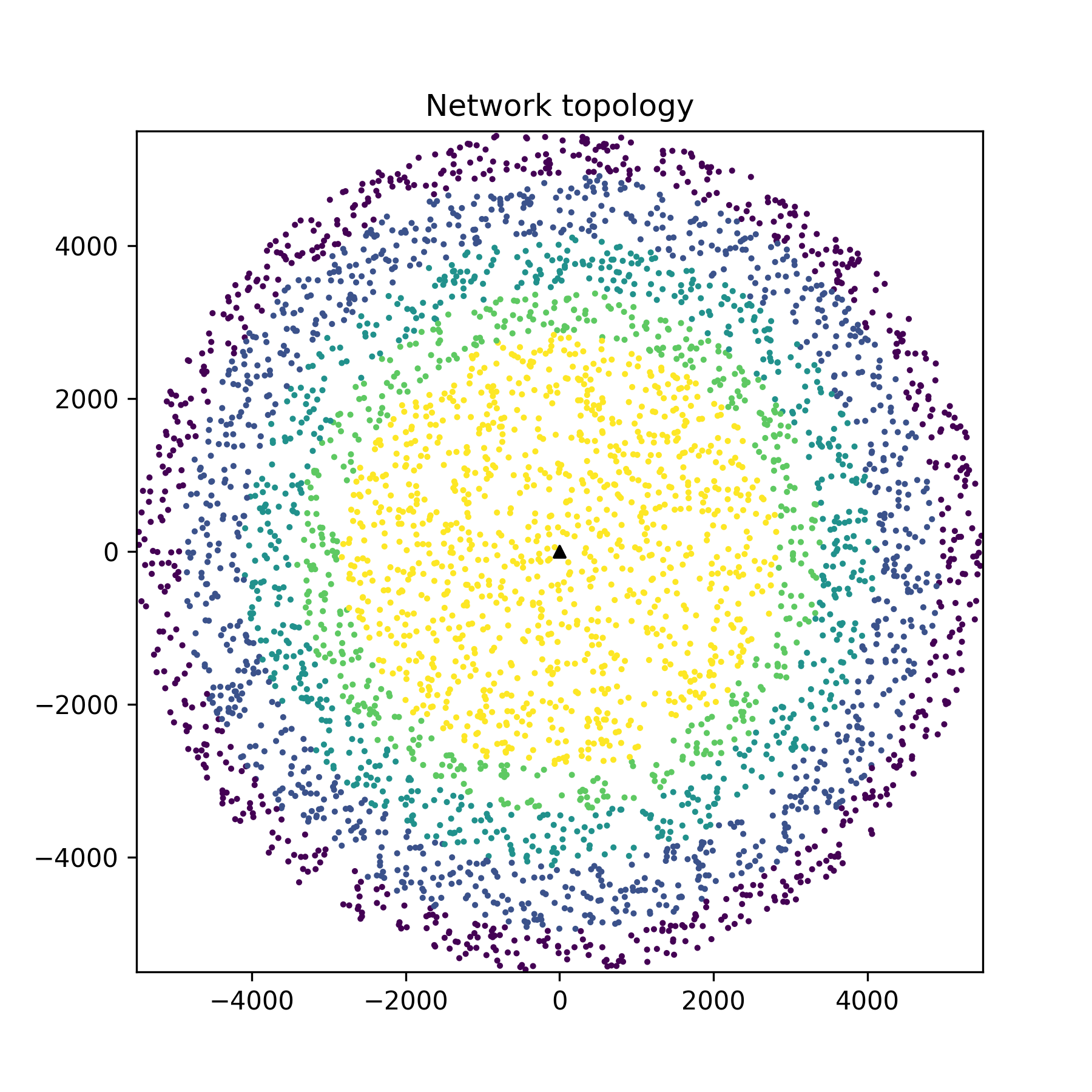
A representation of the network topology.
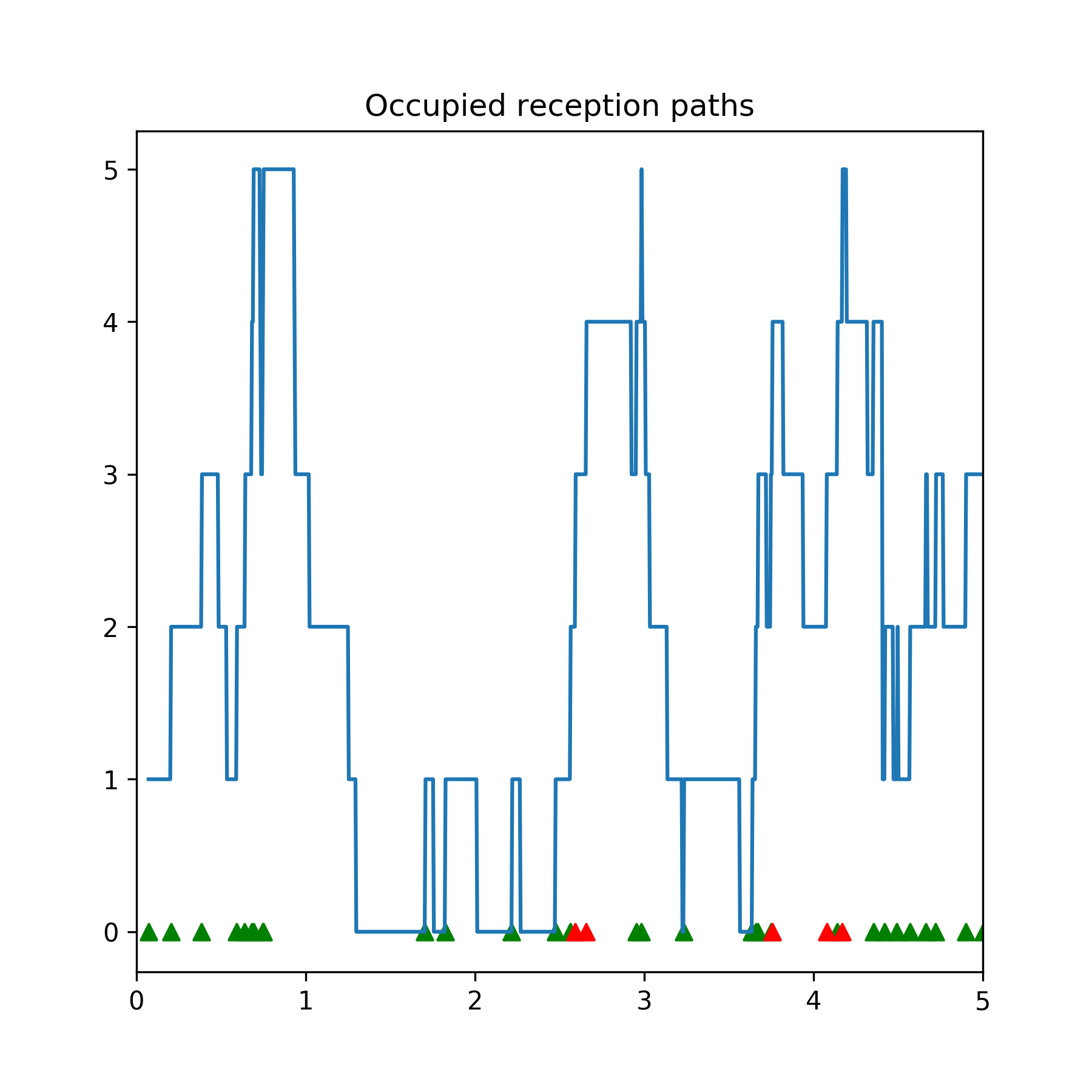
The number of packets currently in reception with respect to time. Packet arrivals are shown as triangles, green for successful packets and red for lost packets.
Finally, the script plots some global metrics, computing the outcome
probabilities of packets through a custom get_outcome_probabilities function
that is passed to sem.CampaignManager.get_results_as_xarray().
Additionally, a metrics list is passed so that the export function can
correctly label the dimension containing results:
#################################
# Plot probabilities of success #
#################################

# This is the function that we will pass to the export function
def get_outcome_probabilities(result):

    # Parse all files into lists
    parsed_result = sem.utils.automatic_parser(result, dtypes, converters)

    # Get the file we are interested in
    outcomes = np.array(parsed_result['packets'])[:, 5]
    successful = sum(outcomes == 0)
    interfered = sum(outcomes == 1)
    no_more_receivers = sum(outcomes == 2)
    under_sensitivity = sum(outcomes == 3)
    total = outcomes.shape[0]

    return [successful/total, interfered/total,
            no_more_receivers/total, under_sensitivity/total]

metrics = ['successful', 'interfered', 'no_more_receivers',
            'under_sensitivity']
results = campaign.get_results_as_xarray(param_combinations,
                                          get_outcome_probabilities,
                                          metrics,
                                          runs)

plt.figure(figsize=[6, 6], dpi=300)
for metric in metrics:
    plt.plot(param_combinations['nDevices'],
              results.reduce(np.mean, 'runs').sel(metrics=metric))
plt.xlabel("Number of End Devices")
plt.ylabel("Probability")
plt.legend(["Success", "Interfered", "No more receivers",
            "Under sensitivity"])
plt.savefig(os.path.join(figure_path, 'outcomes.png'))
The code above produces the following plot:
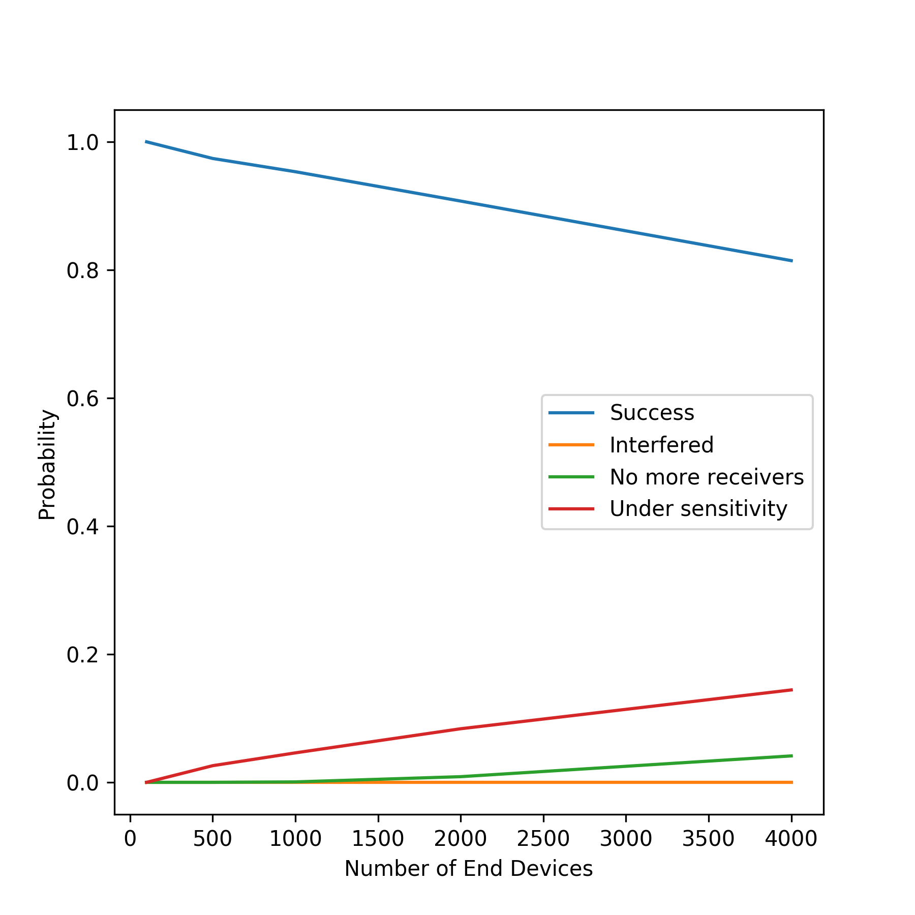
Probabilities for different packet outcomes for a growing number of end devices.
| [1] | For additional information on the LoRaWAN module, refer to the project’s github page. |